An Overview of the Pantone Matching System
The Pantone Color System
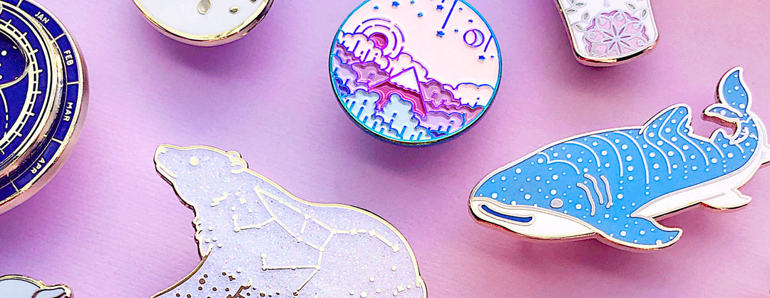
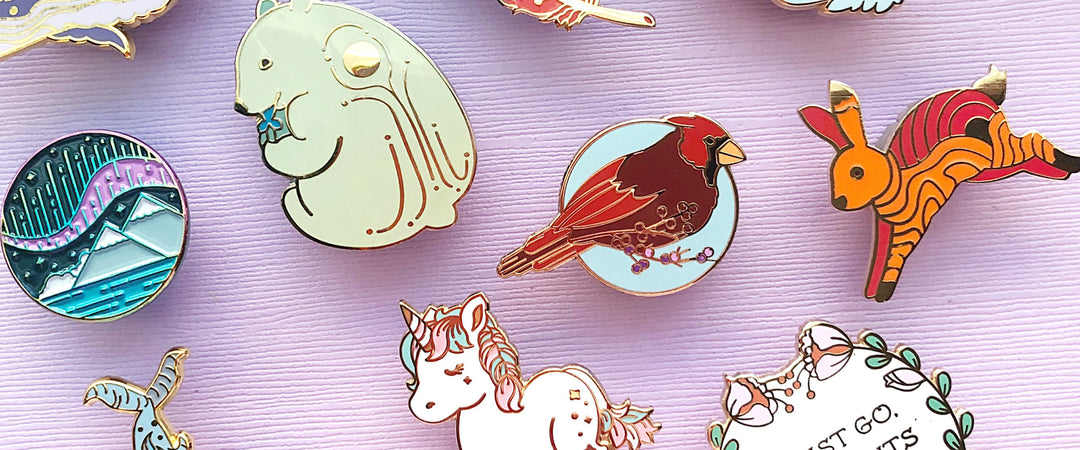
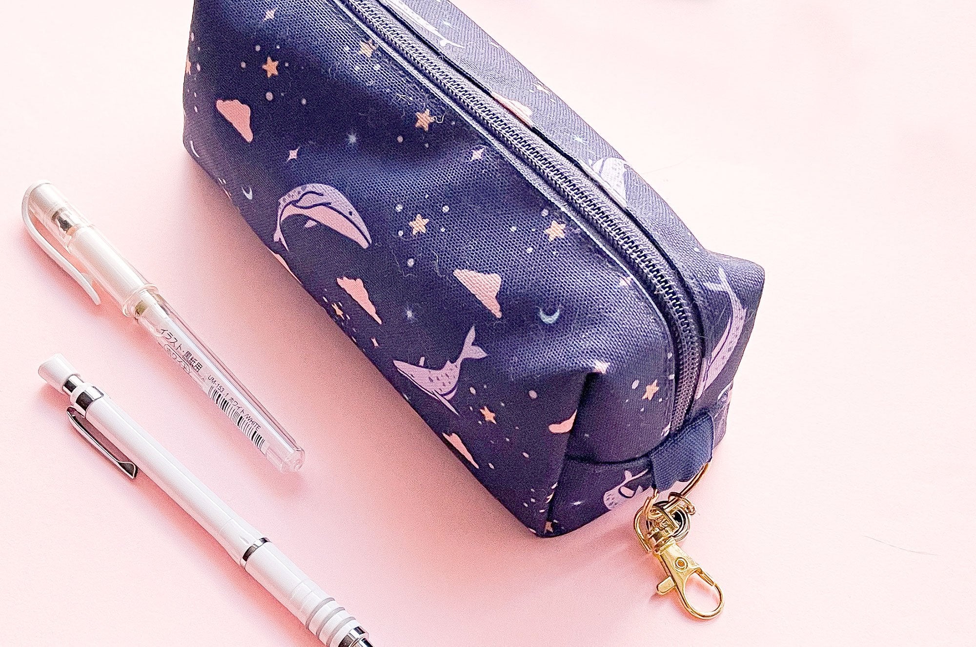
The Pantone Color System is an industry standard color matching structure used worldwide. Also commonly known as the Pantone Matching System or PMS, the Pantone Color System is used by designers and printers to ensure uniformity in color output for physical products that do not use the CMYK model. You need to know the Pantone system if you're interested in making enamel pins, embroidered patches, screen printed goods, and a whole slew of other physical goods.
If all that just sounded like gibberish, let's see if I can clear things up a little bit. In this short article, I'll go over what the Pantone System is, when you need it, why you need it and how to find an affordable Pantone guide for your printed projects.
What is the Pantone Color System?
I'll be referring to the Pantone Color System as the Pantone Matching System or PMS going forward to keep from having to type out the whole thing every time. PMS is an industry standard for designers and printers that helps them ensure that the colors of a product are the same or very close to being the same across different mediums or items.
Why do I need to use it?
To keep consistency in colors across your various projects and production companies. You also need to be able to tell your printer what color of ink you need them to match so that the results will be what you expect. While you don't need the PMS for every printing project, you will need them when dealing with physical products that deal with spot colors. Spot colors are solid colors that are defined by mixing together physical ink instead of via a digital printing method.
It should be noted that Pantone color mixing is half art and half science. You may get some small shifts of color between one batch of items and another even though the Pantone color is the same.
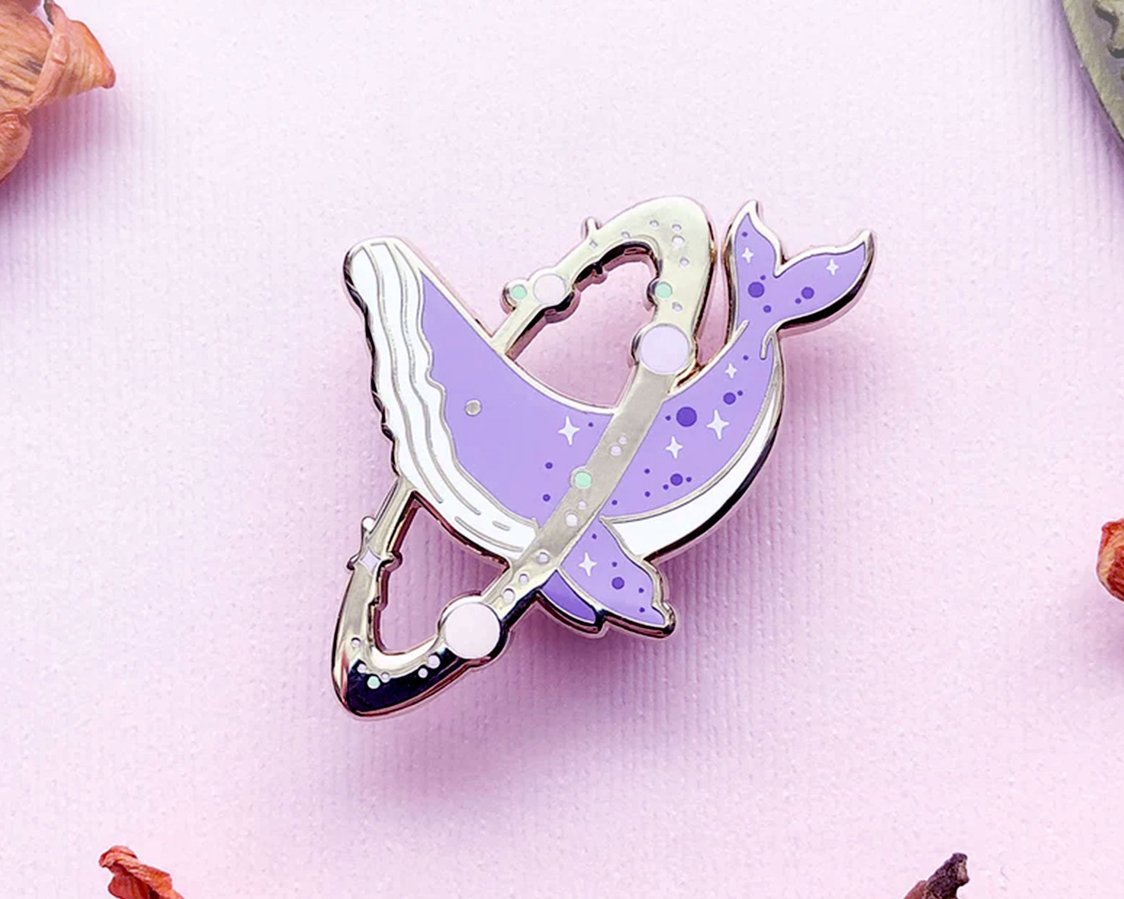
In addition, some products go through additional processing that can also affect their final color, darkening or lightening the eventual results. It's not uncommon for enamel pins, for example, to darken a little bit in color from the enamel filling stage to the firing stage and more.
How do I use the PMS?
The PMS is available through a series of Pantone Guides that are sold by the company that maintains and updates the standard, Pantone LLC. These guides are essentially long cards that fan out to display swatches of color, color codes, the type of paper or medium the swatch is printed on, and the amounts of each color that need to be mixed together to achieve the color on the swatch. In addition to the guides, there are also Pantone swatch books that have the same swatches, just in a book format instead.
When selecting a Pantone color, you use the swatches in the guide to match the colors of your design as closely as possible. Often times, you will not be able to get an exact match because CMYK has a broader spectrum of colors than PMS. So you will have to get as close as possible and compromise a bit on the colors here and there.
Where can I get Pantone guides?
Brand new Pantone guides can be expensive depending on which guides you need to get. For my work, I use the Solid Coated guide about 99% of the time and once in a while will bring out the Solid Uncoated guide. The Pantone Solid Coated and Solid Uncoated guides are typically sold together as a pair. There are guides that are labeled simply as Coated. The difference between Solid Coated and just Coated is the paper that the formula guide is printed on.
You can get these guides from Pantone themselves to ensure you get an authentic and most up-to-date set: Pantone Store.
The guides are expensive. A designer or artist who is just starting out may not be able to justify dropping a few hundred on a pair of Pantone guides--one of which may only come in handy a small percentage of the time.
Used Pantone guides that are sometimes sold secondhand by printers or other designers on sites like eBay or in artist's groups are a more affordable way to acquire your first Pantone swatch guides until you have enough saved up for the updated guides.
If you're going to purchase a secondhand Pantone swatch guide, please remember the following...
Online Pantone swatch resources do exist, and you can definitely use them if you want to. However, your results will vary more widely than if you were using a physical Pantone guide. The variations in screen contrast, vibrance, saturation, brightness, brand, age of the monitor, operating system and more, makes color matching using digital Pantone swatches much less reliable than using a physical guide.
Understandably, due to the cost of the Pantone guides, digital swatches are a better than nothing solution. Please keep in mind how different the colors on your monitor may appear compared to their final printed version if you are using digital swatches to select your colors though. Pantone themselves have an online color matching tool. But it sucks and costs money.
Good news! Here are a couple of non-sucky, free alternatives that I've seen recommended:
• HEX to Pantone
• CalPrint PMS Coated Color Chart
And that's a quick summary and guide on how to use the Pantone Matching System in your work.
The Pantone Color System is an industry standard color matching structure used worldwide. Also commonly known as the Pantone Matching System or PMS, the Pantone Color System is used by designers and printers to ensure uniformity in color output for physical products that do not use the CMYK model. You need to know the Pantone system if you're interested in making enamel pins, embroidered patches, screen printed goods, and a whole slew of other physical goods.
If all that just sounded like gibberish, let's see if I can clear things up a little bit. In this short article, I'll go over what the Pantone System is, when you need it, why you need it and how to find an affordable Pantone guide for your printed projects.
What is the Pantone Color System?
I'll be referring to the Pantone Color System as the Pantone Matching System or PMS going forward to keep from having to type out the whole thing every time. PMS is an industry standard for designers and printers that helps them ensure that the colors of a product are the same or very close to being the same across different mediums or items.
Why do I need to use it?
To keep consistency in colors across your various projects and production companies. You also need to be able to tell your printer what color of ink you need them to match so that the results will be what you expect. While you don't need the PMS for every printing project, you will need them when dealing with physical products that deal with spot colors. Spot colors are solid colors that are defined by mixing together physical ink instead of via a digital printing method.
It should be noted that Pantone color mixing is half art and half science. You may get some small shifts of color between one batch of items and another even though the Pantone color is the same.
In addition, some products go through additional processing that can also affect their final color, darkening or lightening the eventual results. It's not uncommon for enamel pins, for example, to darken a little bit in color from the enamel filling stage to the firing stage and more.
How do I use the PMS?
The PMS is available through a series of Pantone Guides that are sold by the company that maintains and updates the standard, Pantone LLC. These guides are essentially long cards that fan out to display swatches of color, color codes, the type of paper or medium the swatch is printed on, and the amounts of each color that need to be mixed together to achieve the color on the swatch. In addition to the guides, there are also Pantone swatch books that have the same swatches, just in a book format instead.
When selecting a Pantone color, you use the swatches in the guide to match the colors of your design as closely as possible. Often times, you will not be able to get an exact match because CMYK has a broader spectrum of colors than PMS. So you will have to get as close as possible and compromise a bit on the colors here and there.
Where can I get Pantone guides?
Brand new Pantone guides can be expensive depending on which guides you need to get. For my work, I use the Solid Coated guide about 99% of the time and once in a while will bring out the Solid Uncoated guide. The Pantone Solid Coated and Solid Uncoated guides are typically sold together as a pair. There are guides that are labeled simply as Coated. The difference between Solid Coated and just Coated is the paper that the formula guide is printed on.
You can get these guides from Pantone themselves to ensure you get an authentic and most up-to-date set: Pantone Store.
The guides are expensive. A designer or artist who is just starting out may not be able to justify dropping a few hundred on a pair of Pantone guides--one of which may only come in handy a small percentage of the time.
Used Pantone guides that are sometimes sold secondhand by printers or other designers on sites like eBay or in artist's groups are a more affordable way to acquire your first Pantone swatch guides until you have enough saved up for the updated guides.
If you're going to purchase a secondhand Pantone swatch guide, please remember the following...
- Pantone update the swatches in their guides on a fairly regular basis. A guide that is a couple of years old should still be OK, but the older the guide gets, the more outdated it becomes. It may get to the point where you might be referencing colors that have been reformulated or discontinued. When I was first starting out, I had an old Pantone guide set that was over a decade old. Many of the colors in that set were discontinued and I often had to make substitutions for them.
- Make sure you purchase the guide that's right for you. Ask other artists or designers in your space which Pantone guide they use. I use the solid coated guide the most in my work, but another artist might use a different guide more often.
- Some used Pantone guides, particularly ones that were utilized in factory or heavy production settings, will have some wear and tear that affects their color accuracy. Some of the swatches may have faded or the guides have been torn or stained. Ask the seller what condition the guide is in to make sure you are getting one that is in good enough condition to be usable.
- The more specialized Pantone guides (ex. metallics or pastels) are great if you're going to be designing in those color systems a lot. However, some printers or factories may not have access to those guides or those inks and won't support the colors for them.
- Fake guides do exist so be careful out there. If it seems too good to be true, then it very likely is. Generally, a used Pantone guide's cost will depend on its age. The older the guide, the less expensive it will be.
Online Pantone swatch resources do exist, and you can definitely use them if you want to. However, your results will vary more widely than if you were using a physical Pantone guide. The variations in screen contrast, vibrance, saturation, brightness, brand, age of the monitor, operating system and more, makes color matching using digital Pantone swatches much less reliable than using a physical guide.
Understandably, due to the cost of the Pantone guides, digital swatches are a better than nothing solution. Please keep in mind how different the colors on your monitor may appear compared to their final printed version if you are using digital swatches to select your colors though. Pantone themselves have an online color matching tool. But it sucks and costs money.
Good news! Here are a couple of non-sucky, free alternatives that I've seen recommended:
• HEX to Pantone
• CalPrint PMS Coated Color Chart
And that's a quick summary and guide on how to use the Pantone Matching System in your work.